Cyanotypes
Anna atkins.Anna Atkins was a female British photographer and botanist. She was the first person to crate a book illustrated with photography to help illustrate plants, some people would say that she was the first woman to ever take a photograph. She first used the process of creating cyanotypes when she met the British inventor william henry fox talbot. She used cyanotypes to document all of the different kinds of British algae and published this in her book.
|
|
|
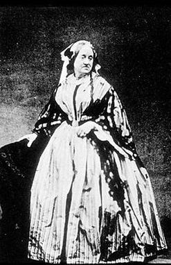
On the left is a photo of Anna Atkins. Her discoveries lead to some of the most important developments in photography to date. Her books on natural forms revolutionised the way we look at the plants around us and changed how we document objects. Her photos meant people didn't have to rely on artists to depict plants allowing more accurate representations to be shared. As the pictures were un reproducible this lead to people trying to develop negatives so the same images could be printed. The idea of taking photos rather than using art to show plants was a completely new idea and changed perceptions on how to share knowledge and information.
|
|
|
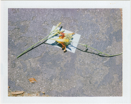
examples.These are some examples of cyanotypes that I liked. I really loved all of these as they have lots of different textures. I really like the colour of cyanotypes and find it amazing that the pictures are made of just one colour. My favourite ones are the ones where the object is slightly transparent and allow some light to pass through the them giving the piece a variety of tones
|
The process.The paper we used was covered in light sensitive cyan coloured liquid. before we exposed the paper to the sun we chose a selection of objects and decided how we would compose them on the paper. We had to place them on the paper quickly and left them in the sun for 10 minutes. when they had left a shadow we washed them in plain water to fix them. This washed off the chemicals and stopped them from developing further.
|
|
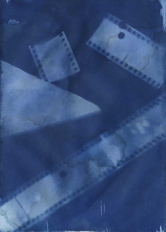
image.1 |
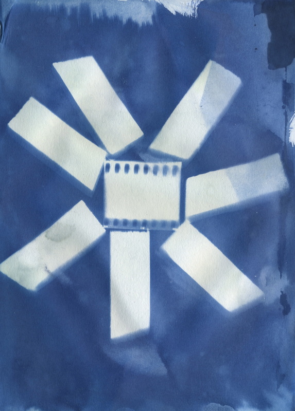
image.2 |
|
I prefer this one out of the two. I like the composition on this one and I love the affect of the film real. some of the images on the slides came through and I really liked this as it is like a picture within another picture. I also like the water stains on the paper as it gives it character. If I had done this one differently I would have left it for a little longer to make the white more vibrant. I would also have liked to use more film reel to try and get more images shadows on the paper.
|
I like the paint brush affect at the edges of the page and the tones of the background. I didn't like this one when I made it as I didn't like the pattern but it turned out better than I had expected. The contrast between the white and the blue is really profound in this image and I think this is my favourite thing about it. I don't really like the composition of the image but it technically worked really well. I enjoyed making these as I found it amazing how you can create a image using just the suns light and paper.
|
